

Last Updated on April 14, 2025
Want to improve your site’s navigation?
In this guide, I will share smart ways to organize your SharePoint site and help users find content faster.
Let’s get started.
Table of Contents:
First off, let’s make sure we are on the same page when it comes to the navigation components in SharePoint.
Primary, there are 4 navigation parts:
- Top navigation bar
- Quick launch (left-hand navigation)
- Hub navigation
- Footer navigation
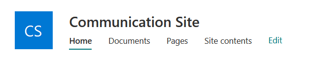
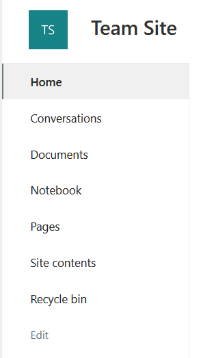
The top navigation bar (communication sites) and the quick launch navigation (team sites) are more or less the same.
They serve the same purpose, and the only difference is that they show up in different types of sites and their placement.
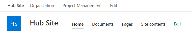
Hub navigation is used when you’re connecting several SharePoint Online sites together under one “hub site.”
It’s found at the top of the page above the site name and other menus, including the top navigation bar for communication sites.
Footer navigation is exactly what it sounds like: links placed at the bottom of a SharePoint Online site.
Currently, only communication sites support it natively, as team sites don’t have a footer unless you custom-develop one.

You will see it at the very bottom of the page, below everything else, below the content, the standard Microsoft footer, etc.
Sign up for exclusive updates, tips, and strategies
With that, here are practices that I recommend to make the SharePoint site easier to use through its navigation:
Imagine the top navigation bar with 15+ links, vague titles, and deep nesting.
That gets messy fast, and users will either get lost or just give up.
Keeping it simple means:
- Using short, descriptive names for links
- Only showing what’s necessary for the audience
- Grouping related items together
Think of it like a clean restaurant menu, just the essentials, grouped in a way that makes sense. 🙂
2. Maintain a consistent layout
What I mean here is making sure the navigation looks and behaves the same across all the sites your users visit.
You can do it by:
- Having the same style of navigation (top or left) on all sites
- Sticking with uniform labels
- Organizing items in the same order when possible
For example, don’t call it “Documents” on one site and “Files” on another.
When things change from site to site, users have to stop and figure things out each time (consistency removes that friction).
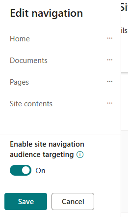
3. Use audience targeting
Audience targeting is a feature that lets you show specific navigation links (or even content) to certain groups of users.
Here’s how it works:
- You can set visibility rules on links in your navigation (both in the Quick Launch and the top nav).
- These rules are based on Microsoft 365 groups, Azure AD security groups, or even individual users.
- When someone visits the site, they only see the links meant for them; others are hidden.
You would know when that navigation component supports audience targeting because you will see it in the options.
For example, say you have a link to HR policies:
- You might want only your HR team to see that.
- You target that link to the “HR Team” group.
Everyone else? They won’t even know it exists.
That’s great for keeping navigation clean and relevant, especially for a big organization with lots of teams using the same site.
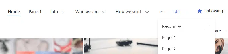
4. Limit levels
This one is closely related to keeping things simple.
Limiting levels means not going too deep with nested links by avoiding long, complex click paths just to find something basic.
On the bright side, SharePoint already caps navigation depth at 3 levels, so the platform itself enforces this one for you.
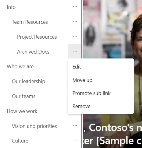
That said, even within those 3 levels, it’s still easy to overdo it.
For example, having a mega menu full of nested links in every section can still feel overwhelming, even if it’s technically allowed.
Here are sample scenarios:
| Too Complex Nav | Simplified Nav | Details Moved To |
| 10 links: Project A, Project B, … Project J | Projects | A “Projects” page with links and short descriptions for each project |
| 8 separate links: Leave Policy, Attendance Policy, Dress Code, etc. | HR Policies | A single HR Policies page with all policy links grouped by category |
| 6 links: Marketing Docs, Sales Docs, Design Docs, Dev Docs, Finance Docs, Legal Docs | Documents | A Documents page organized with sections or tabs for each department |
If the nav feels crowded or hard to scan, it might be better to cut down the number of links or group them more smartly.
It’s less about hitting the max and more about making thoughtful choices with what you put there.
Do you have any questions about the navigation tips I shared here? Let me know in the comments.
For any business-related queries or concerns, contact me through the contact form. I always reply. 🙂


