

Last Updated on June 8, 2024
Do you need to add a chart to your site?
It makes sense if you need to add a report or dashboard to show people (like your boss) information in an easy-to-digest method.
In this article, I’ll show you the options to add a chart to your SharePoint site and how they stack up against each other.
Let’s get started.
Table of Contents:
Method 1: Quick chart
The in-built charting feature in SharePoint is packed in its “Quick chart” web part.
Compared to the chart options in apps built for data and visualizations, the web part is rather simplistic — but it gets the job done.
The downside here is the limitations:
You can only visualize up to 50 data points when you use data from a list that’s already on the site. Shorter when you enter the data yourself.
Here’s how to use it:
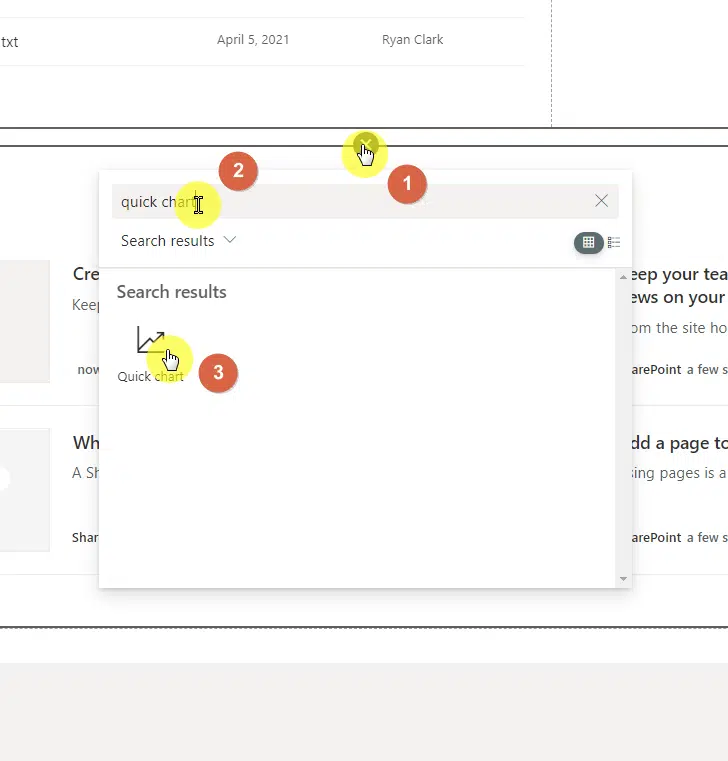
- Go to edit mode to configure the page
- Hover over where you want to place the chart on the page
- Click the plus button and search for the “Quick chart” web part
Note: If you need help in regards to adding a web part to a page in SharePoint, check out this guide here where I explained it little by little.
Then, click the pencil button to configure the web part:
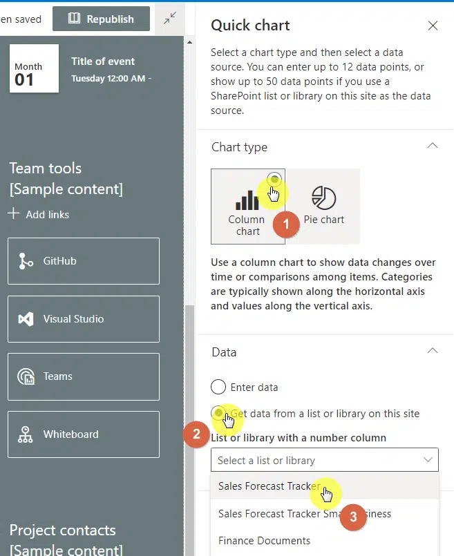
Right after that, a settings panel will slide in from the right:
- Choose the type of chart you want to use
- Select the source of data (enter it yourself or get it from a list/library)
If you choose the option to enter the data yourself, you will be able to enter the data label and value with a maximum of 12 pairs.
If you chose to get the data from a list/library instead:
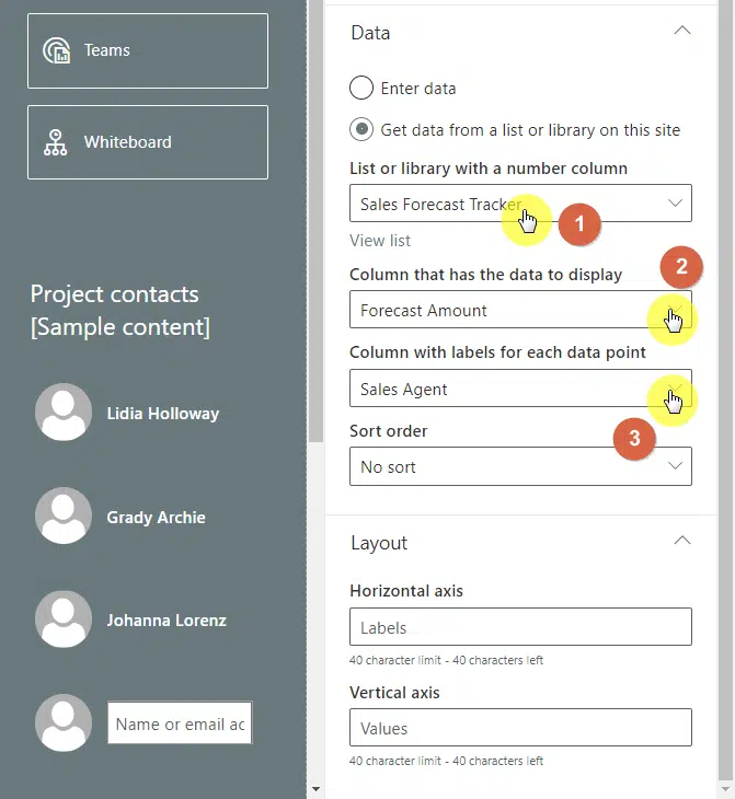
- Select the list/library with data
- Choose the columns with data and labels
- Other options are optional
The graph will automatically update and will show you what the chart looks like. Don’t forget to add the chart name at the top.
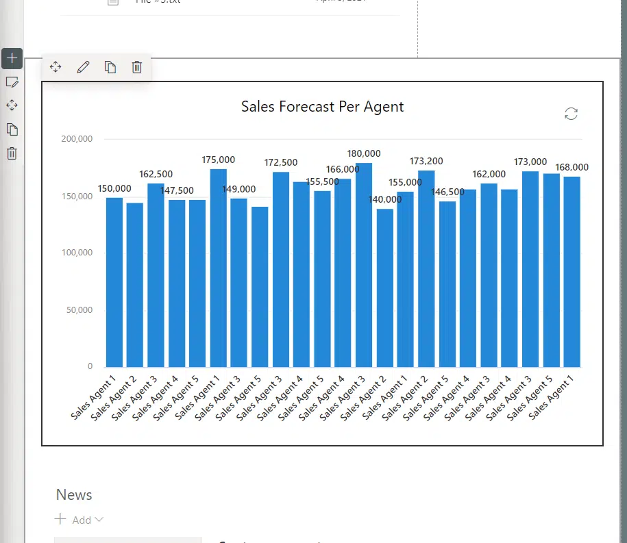
If you’re concerned about the looks, it’s unfortunate that there’s no way to configure the chart design yourself.
If you want more freedom in designing the chart, you’re better off with the second method:
Sign up for exclusive updates, tips, and strategies
Method 2: File viewer
Did you know that you can show a file (or rather, a document) the way it is?
This is done by using the “File viewer” web part. This also means that you can customize a chart as much as you want and simply embed it on the page.
The downside to this is that you won’t be able to edit the chart on the page (although you can always edit the file as much as you want).
Here’s how to use it:
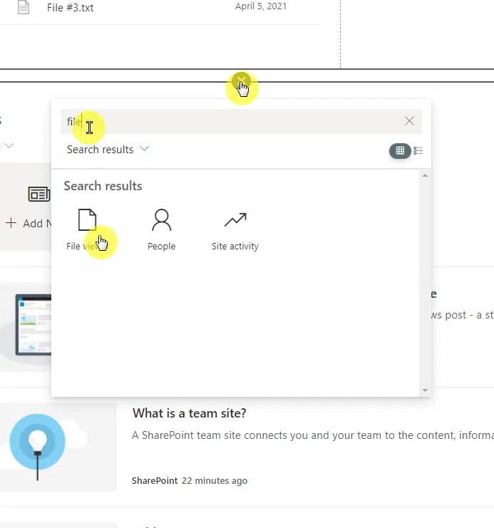
- Indicate where you want to add the chart on the page
- Search for “file viewer” and click on it
Note: If you’re interested in the different web parts in SharePoint, check this list I created that contained all of them!
On the next page:
- Find the file or upload it to SharePoint
- Click the “Add file” or “Insert” button at the bottom

After that, you will see the entire workbook by default. Fortunately, there is actually a way to just show the chart or visualization in the file viewer.
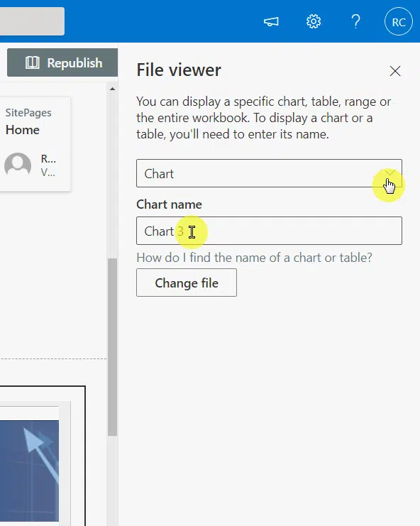
In the settings panel:
- Change the display option to “Chart“
- Enter the chart name in the second field
- Hit the “Apply” button at the bottom of the panel
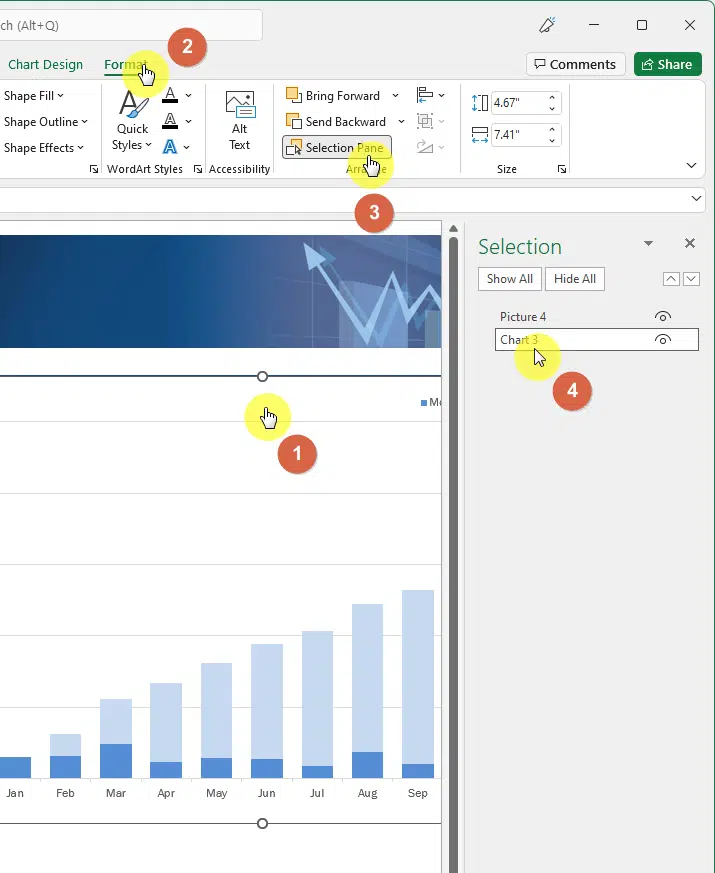
The tricky part is actually figuring out the name of your chart. Well, if it’s in Excel, it’s easy:
- Navigate to the file and select the chart
- Go to the “Format” tab in the ribbon
- Click the “Selection Pane” button on the ribbon
- The highlighted name is the name of the chart
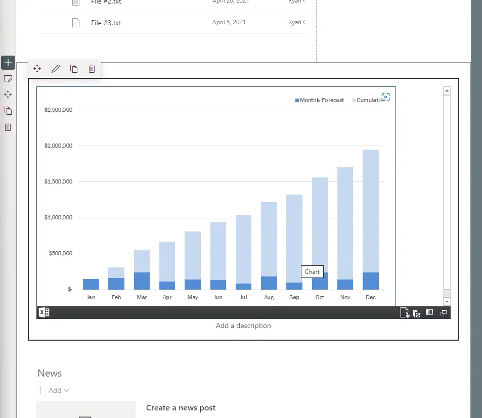
Once you’re able to pinpoint the correct chart, the file viewer will update and only show the chart in full:
Method 3: Power BI
When it comes to visualizations, Power BI is one of the best out there.
So if you already have dashboards and reports in Power BI, you can instead embed them directly to SharePoint and show your nice-looking charts.
On the downside, not everyone can use this since you need to know Power BI beforehand to create good-looking reports.
Here’s how to use it:
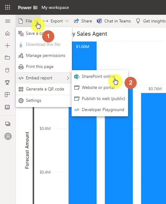
- Navigate to your report in Power BI
- Click the “File” tab from the ribbon
- Hover your mouse to “Embed report“
- Select “SharePoint online” from the list
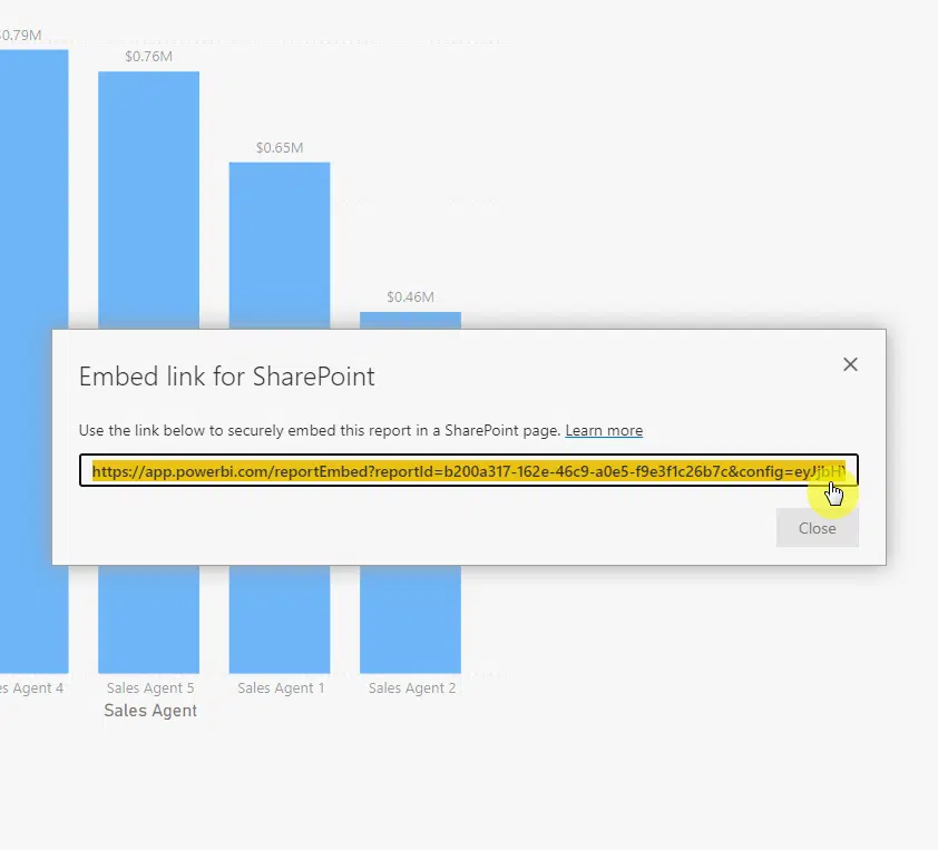
Copy the embed link that Power BI will show you:
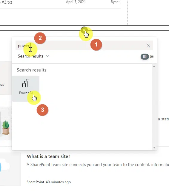
Now, go back to the SharePoint page where you want to put the chart:
- Indicate the place on the page where you want to put the chart
- Search for “Power BI” and select the web part
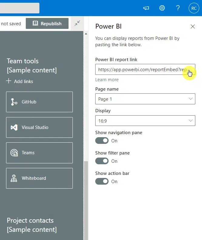
On the settings panel:
- Paste the embed link on the first field
- Configure the display report as you want
You will then be able to see the chart in the web part along with the other settings that you enabled in the panel:
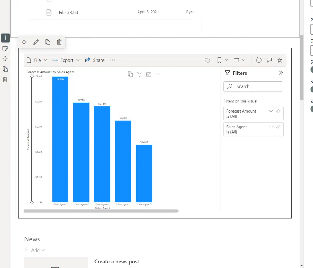
Note: Charts embedded from Power BI are dynamic and interactive — like how you will feel if you’re using the chart in Power BI itself.
Now, there’s actually another option to use a chart in SharePoint using the “Embed” web part.
However, I don’t recommend it for the following reasons:
- Any chart embedded through this method doesn’t look good
- The web part feels a little clunky and will literally embed the source page
Which chart option do you like the best in SharePoint? Share your thoughts in the comment section
For inquiries and other concerns, please use the site’s contact form and I’ll get back to you as soon as possible.


