

Last Updated on January 15, 2025
Interested in Power BI dashboards?
In this guide, let’s talk about Power BI dashboards, features, components, how to create one, and more.
Let’s get started.
Table of Contents:
What’s a Power BI dashboard?
A Power BI dashboard is a single-page view of your most important data.
Often compared with a report, a dashboard provides interactive visuals that help track and analyze key metrics at a glance.
Its key features include:
- Interactive visuals: Users can click on visuals to explore data further.
- Single-page design: Combines multiple data points into one concise view.
- Real-time updates: Dashboards update automatically with live data.
- Customizable: Choose visuals and layouts to fit your needs.
As for its relation with reports, a dashboard is built using data from reports and datasets.
Dashboards basically act as a “snapshot” to monitor performance, track trends, and for data visualization.
But unlike reports, they focus on high-level insights, which is perfect for decision-makers and data analysts.
👉 Related: Can You Publish Power BI Dashboard to SharePoint (Options)
Sign up for exclusive updates, tips, and strategies
Components of a Power BI Dashboard
A dashboard is made up of key elements, each part working together to create a cohesive and interactive view of your data.
1. Tiles
Tiles are individual visual elements displayed on a Power BI dashboard.
They serve as snapshots of key data points:
Its key characteristics include:
- Visual variety (charts, graphs, maps, etc.)
- Interactive
- Customizable
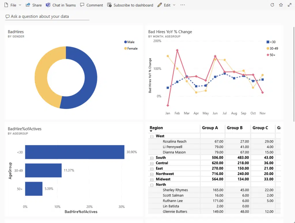
It’s interactive in a way that clicking a tile links back to its source report, which (ideally) will give you deeper insights.
But as you can see, tiles provide a high-level overview of data in a visually appealing way.
Each tile is pinned from a report or dataset and designed to focus on specific metrics, so they’re easy to scan for analysis.
Imagine using this to monitor key performance indicators for your sales data or tracking critical data points.
2. Reports
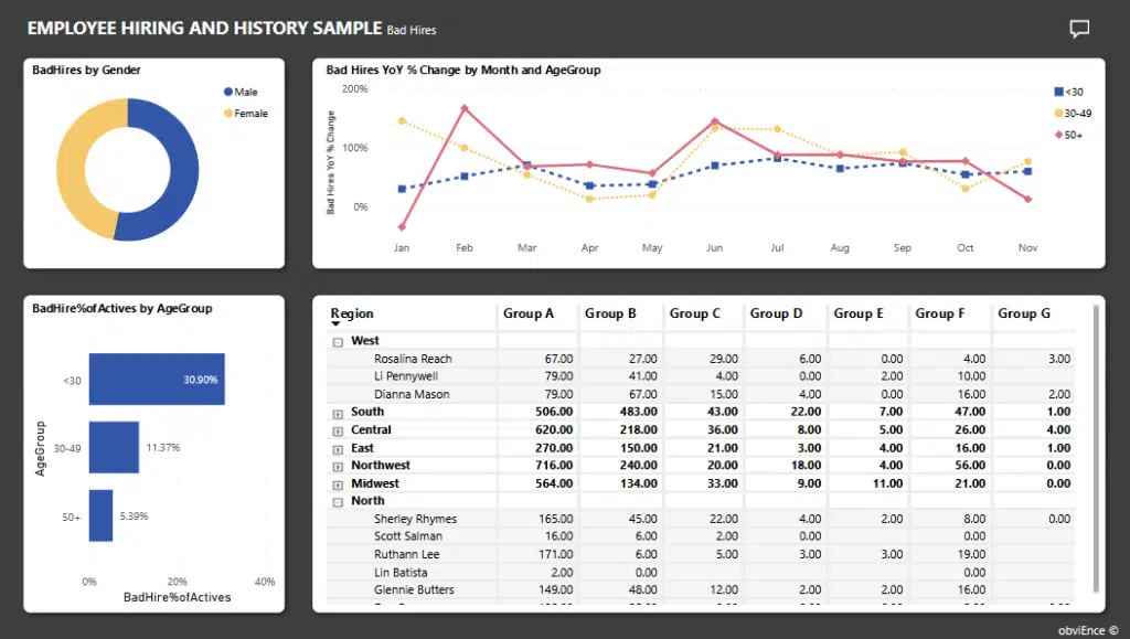
Reports in Power BI are detailed, multi-page analyses that provide in-depth insights into your data.
They are the source for creating dashboard tiles, as in the case of the screenshot you have seen earlier:
Key characteristics of reports include:
- Multi-page
- Interactive
- Data-driven
Reports are the backbone of dashboards, which offer the raw insights behind each tile.
While dashboards give an overview, reports allow users to explore and analyze the data further for better understanding.
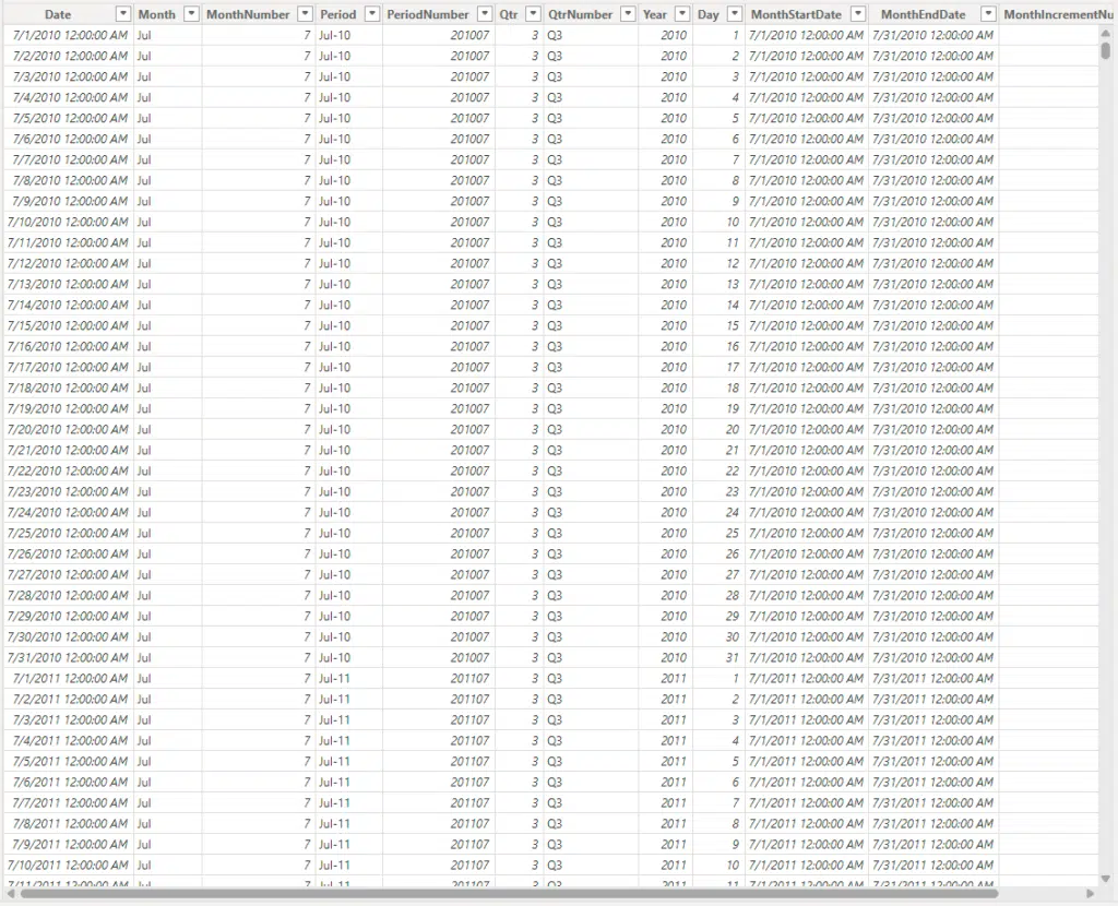
3. Datasets
Datasets are the collections of data that power your Power BI dashboards and reports.
They form the foundation for all visuals and insights:
Key characteristics include:
- Multiple sources
- Reusable
- Dynamic updates
Datasets act as the starting point for analysis.
They store the raw/processed data so users to create visuals, perform calculations, and track performance in real time.
Unfortunately, one caveat is that you can only view the dataset while using the Power BI Desktop app.
Creating a Power BI Dashboard
What’s great is that creating a dashboard is simple and doesn’t require much effort, though it might confuse you at first.
One thing to note is that you can only create a dashboard while using Power BI Service (Online), so there’s that.
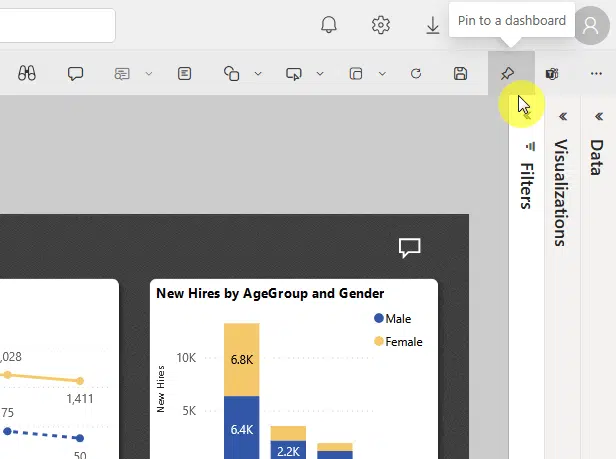
But anyway, if you want to create a dashboard, open the source report, and edit that report, then watch out for pin icons.
If you want to pin the whole report, you should see a pin icon on the top-right corner of the canvas:
This will open a small window where you can either pin the report (or visual) to:
- An existing dashboard
- A new dashboard
It looks like this:
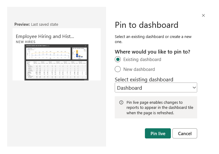
If you select the existing dashboard option, then simply select the dashboard, if a new one, give it a name.
If you want to pin a specific visual instead, all you need to do is hover your mouse over it and click its pin icon.
Like this:
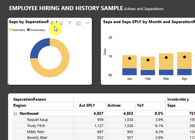
After that, the same window will appear, in fact, you will need to do this to every single element you want to pin. 😅
👉 Related: How to Make Dashboard Bigger in SharePoint Online
Power BI Dashboards vs. Reports
Microsoft Power BI reports and dashboards serve different purposes.
While they share some similarities, their structure and functionality set them apart, with their key differences on:
- Dashboards: Single-page, high-level overview of key metrics.
- Reports: Multi-page, detailed analysis of data.
- Interactivity: Dashboards let you view data at a glance, while reports allow in-depth filtering and exploration.
- Data Sources: Dashboards combine visuals from multiple reports, but reports focus on one dataset.
Dashboards are best for monitoring real-time performance, while reports are ideal for exploring trends and deeper insights.
Do you have any questions about Power BI dashboards and how to create one? Let me know below.
For any business-related queries or concerns, contact me through the contact form. I always reply. 🙂


